

Why Does Your Mobile Store Annoy Customers? Thumb Zone Ergonomics and 5 Mobile E-commerce Rules
More than 75% of orders in Polish e-commerce start on a smartphone screen. Yet most stores are still miniature desktop versions that force acrobatic hand gymnastics. See how to design a buying journey around the natural reach of a single thumb.
Almost every store owner evaluates implementations on a 27-inch monitor with a precise office mouse. Meanwhile GA4 reports tell the truth: 70% to 85% of real traffic comes from smartphones.
When a customer is a car passenger, standing in a queue or resting on the sofa, they hold the phone in one hand and operate the interface with a single thumb. If you make them reach for the menu in the top-left corner or aim at microscopic variants, impatience wins. Customers do not analyse UX mistakes — they simply close the tab and buy on a platform that requires no effort.
“A mouse cursor has single-pixel precision. A human thumb is a contact patch 12 millimetres across. If you design a mobile store like a shrunken computer, you are blocking your own sales.”
— the PUSH mobile design principleHere are 5 engineering standards for designing around the thumb zone that remove physical friction and raise conversion on mobile devices.
A bottom navigation bar instead of a menu hidden at the top
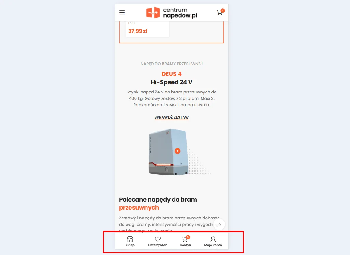
The top corners of a phone screen are a discomfort zone for the hand. Reaching there with a thumb requires changing your grip and risks dropping the device. Moving key navigation points to the bottom edge makes browsing the store intuitive and no longer requires the second hand.
- Key actions under the thumb: Placing the store, wishlist, cart with counter and customer account icons on a fixed bottom bar.
- Reducing touch distance: The customer moves to checkout or a category with an effortless hand movement.
- Native app pattern: Leveraging habits users already have from Allegro or mobile banking interfaces.
Sticky add-to-cart bar for long descriptions
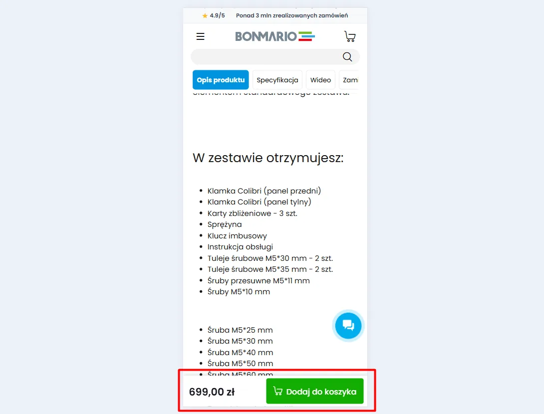
On a phone, the technical specification and photos take several full screens of scrolling. When a customer decides to buy at the very bottom of the page, forcing them to scroll back up creates unnecessary resistance. A floating buy dock guarantees constant access to the transaction.
- Activation once the main button leaves the view: The bar appears smoothly when the main button disappears from view.
- Constant price exposure: A clear gross amount and a large, contrasty “Add to cart” button.
- Zero scrolling to find the cart: Going straight to order completion at the moment of decision.
Swipe gallery with a clear frame counter
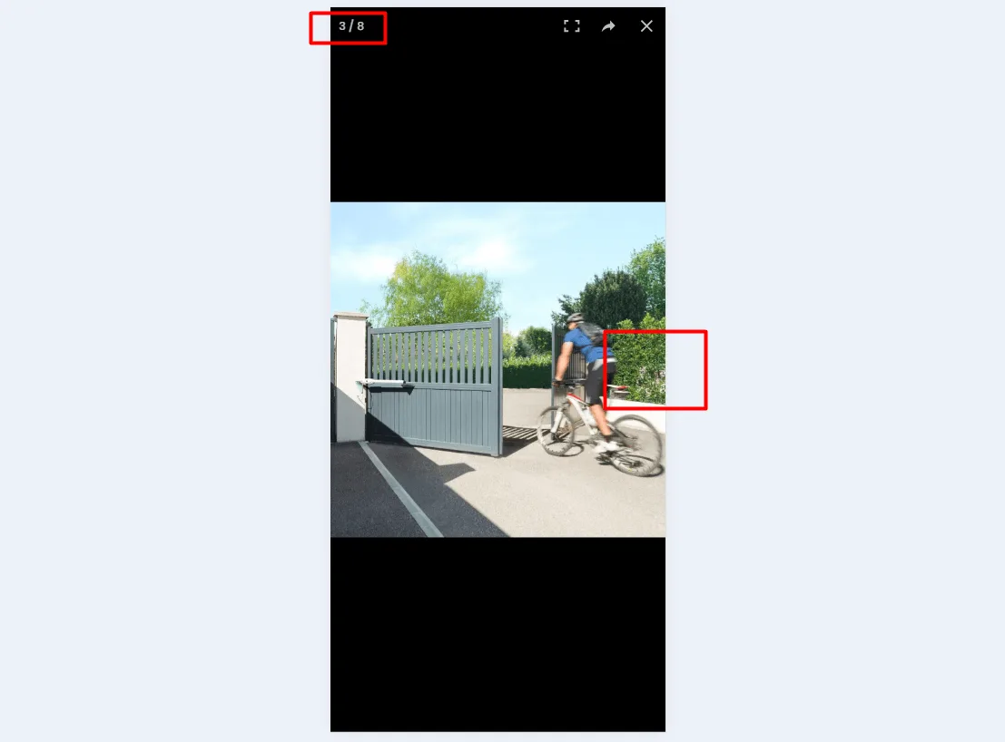
Smartphone users instinctively browse photos by swiping sideways. Forcing them to hit tiny arrows or minuscule dots under the photo contradicts touch mechanics. Information about how many shots are available matters just as much.
- Smooth native swipe gesture: Light horizontal photo scrolling without rendering delays.
- Readable frame counter: A clear frame marker (e.g. 3 / 8) showing the gallery size without covering details.
- Full-screen detail preview: The ability to zoom a photo with a pinch gesture.
Large variant tiles instead of awkward dropdowns
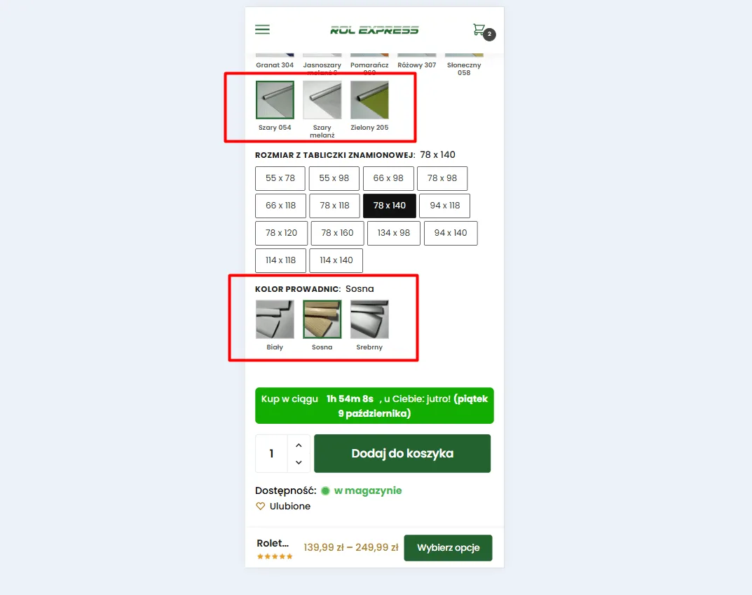
Classic dropdowns are a relic of the desktop era. On a touch screen they require a double tap and open native system pickers. Replacing them with large visual tiles at least 44x44 pixels in size eliminates accidental taps entirely.
- Visual material swatches: Thumbnails of real fabrics and colours with a clear outline on the selected variant.
- Tile-based size matrices: Separated dimension buttons with a safe touch margin.
- Stock status preview: Automatic update of dispatch time and availability after tapping a selected tile.
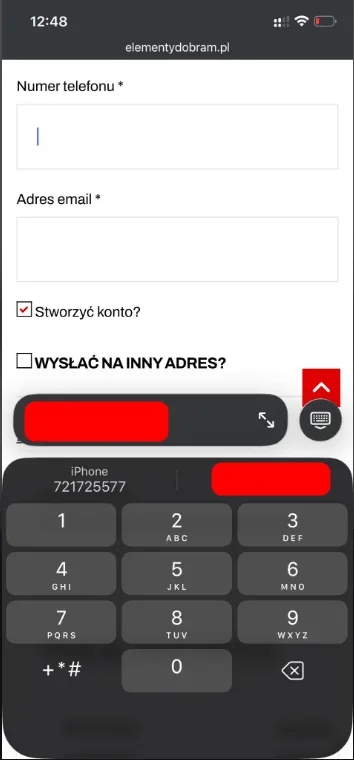
Forced numeric keyboard on phone and code fields
Unoptimised form fields force users to manually switch the phone keyboard from letters to digits when entering a phone number, postcode or BLIK code. That small friction, repeated three times in checkout, can lead to abandoning the order on the final straight.
- The inputmode="numeric" attribute: Instantly bringing up a large numeric keyboard on iOS and Android.
- Correct autocomplete tags: System-level suggestion of the saved phone number with one tap above the keyboard.
- Protection against typos: Large numeric keys reduce the risk of errors in contact and delivery data.
Contact
Request a free audit of your store.
Fill in the form. Dawid, Lead Architect at PUSH, will analyse your store and get back to you within 24 hours with an actionable plan.

“Instead of hunting for random freelancers for every fix, we handed them full control over technology and campaigns. The store finally runs without issues, our customer acquisition costs dropped drastically, and we can focus solely on logistics and order fulfilment.”
Martyna – Co-owner, Rolexpress.pl