

Why Are Customers Afraid to Buy Expensive Products Online? 6 Product Page Changes That Remove the Resistance
Buying an 80 PLN T-shirt is a risk-free impulse. Buying automation, machinery or equipment for several thousand PLN is enormous decision stress for the customer. See how to design a product page that resolves technical doubts and turns hesitation into a completed order.
When a customer buys a small everyday item online, they decide within seconds. If the product disappoints, they shrug or return the parcel on the way home from work. The financial risk is negligible.
The situation changes completely when you run a specialist store, sell technical equipment, gate automation or security systems, or serve business customers whose carts are worth 2,000, 5,000 or 15,000 PLN. There are no impulse purchases here. Every cursor movement is a cold risk calculation and one question in the buyer’s head:
“The most common reason for abandoning an expensive product is not its price but decision paralysis. Customers leave the store the moment they are not 100% certain they picked the right variant.”
— the PUSH decision-safety principleMost stores treat a 3,000 PLN automation kit the same way as a pair of shoes: one catalogue photo, a raw distributor description and a big red buy button. Below are 6 product page elements from our production deployments that step by step remove the customer’s fear of spending serious money.
Key technical parameters in sight (instead of a wall of text)
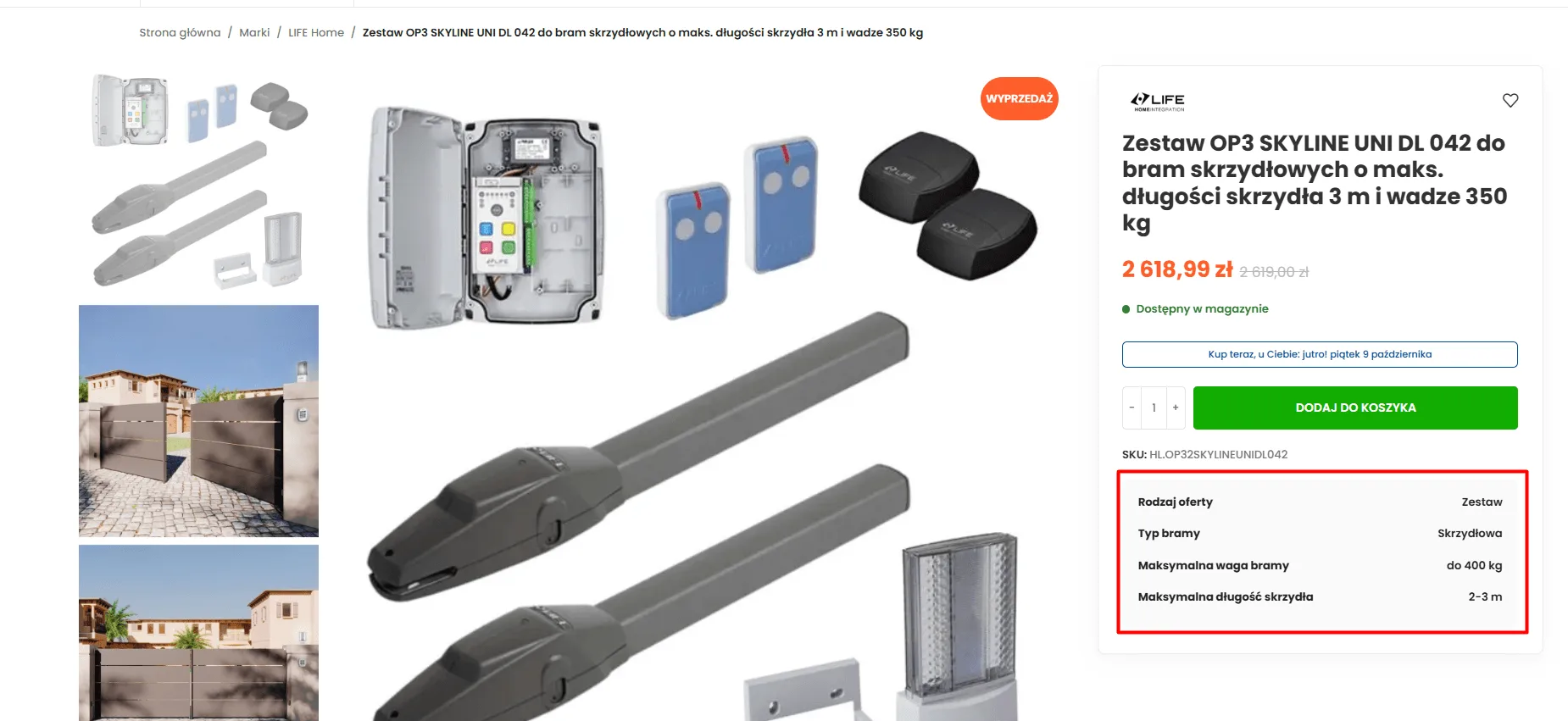
When a buyer opens a high-value product page, they need to confirm within 3 seconds that the solution matches their installation conditions. Hiding load capacity, length or intended use in a multi-page text description forces users to scan laboriously. Instead we place a clear box of the key boundary parameters directly under the buy button.
- At most 4 key criteria: Extracting only the data that determines compatibility (e.g. gate type, maximum weight, leaf length).
- Placement next to price and availability: The customer sees the boundary parameters in the same frame in which they decide to add to cart.
- Removing installation doubts: Clear information reduces the number of email enquiries about basic technical data.
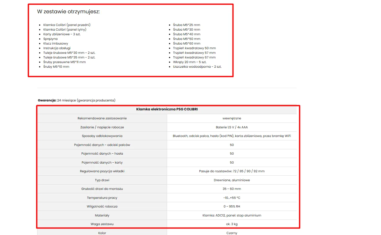
“What you get in the box” section and an ordered specification table
With pricier products customers are terrified of hidden costs – ordering equipment and then discovering during installation that a critical mounting bolt, battery, cable or bracket is missing. The lack of a precise bundle contents list is one of the main reasons purchases get postponed.
- Item-by-item contents listing: An exact list of every element, bolt and accessory inside the box.
- An engineering table instead of marketing copy: Electrical parameters, temperature ranges, dimensions and materials laid out in a readable two-column matrix.
- Building installer trust: A professional sees they are not buying “a pig in a poke” but a complete, work-ready solution.
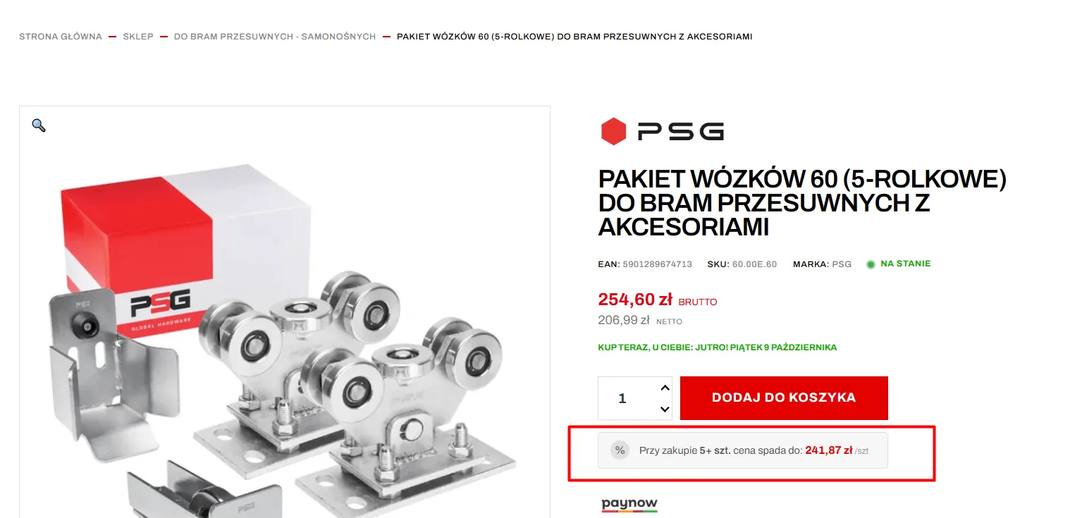
Net/gross pricing and automatic volume discounts for businesses
Businesses and installers calculate profitability on net amounts only. Forcing them to subtract VAT in their heads discourages business purchases. Moreover, professional customers rarely order a single unit – they need stock for current jobs or projects.
- Side-by-side rate exposure: A large, clear gross price with a readable net value right underneath.
- Visible quantity discount thresholds: Information about the instant unit price drop when buying a pack (e.g. from 5 units).
- Increasing AOV (average order value): The mechanism encourages buyers to add more units to the cart in order to lower the unit cost.
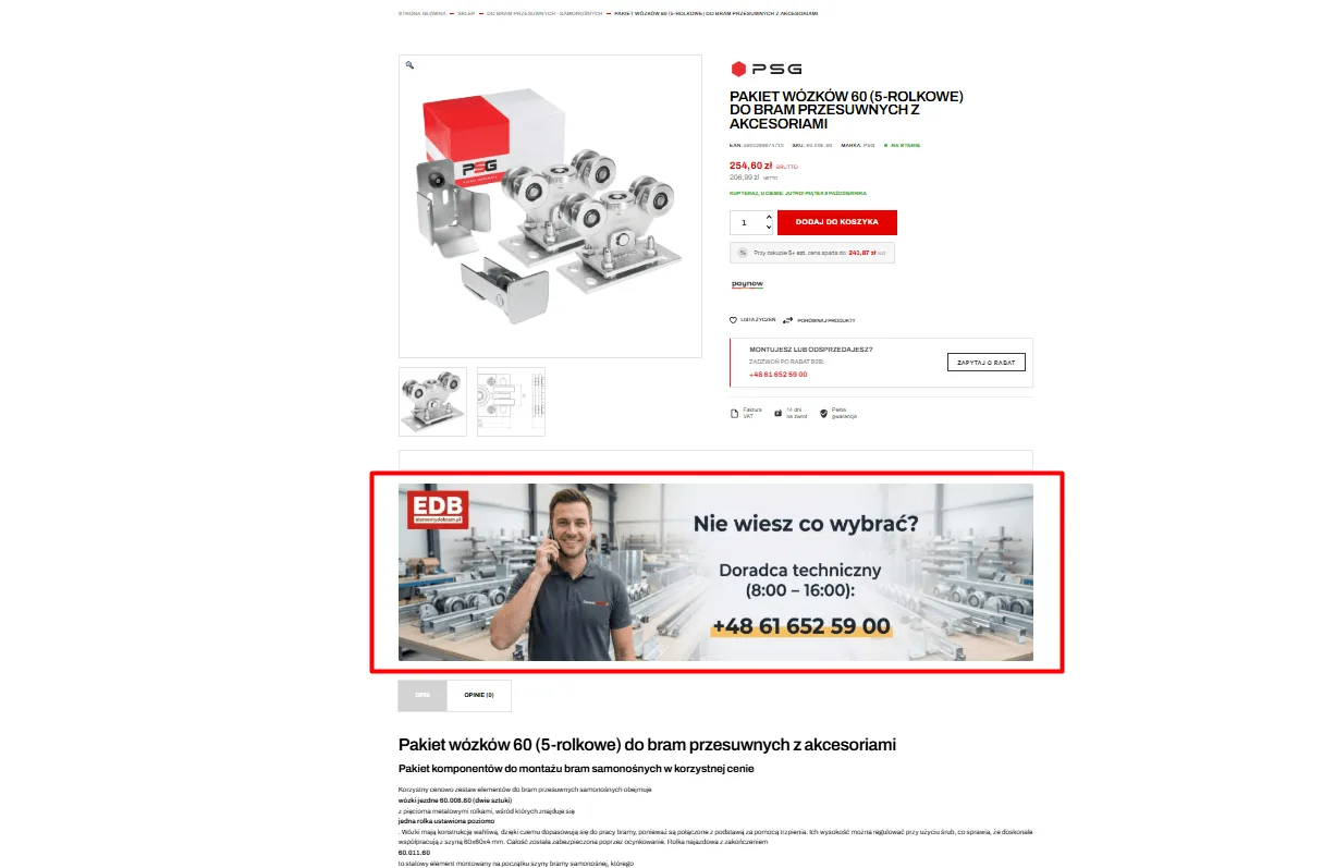
Direct contact with an engineer instead of an annoying chatbot
For specialist orders, generic bots built on canned formulas irritate customers. When someone is about to spend a substantial amount, they expect confirmation from a human who knows the assortment hands-on and takes responsibility for the advice.
- Prominent support banner: Placing a “Not sure what to choose?” section in the middle of the browsing path.
- A real human: A photo of the technical adviser, a direct landline or mobile number and clear duty hours (e.g. 8:00 – 16:00).
- A fast wholesale quote path: A quote request button for project discounts aimed at installers and resellers.
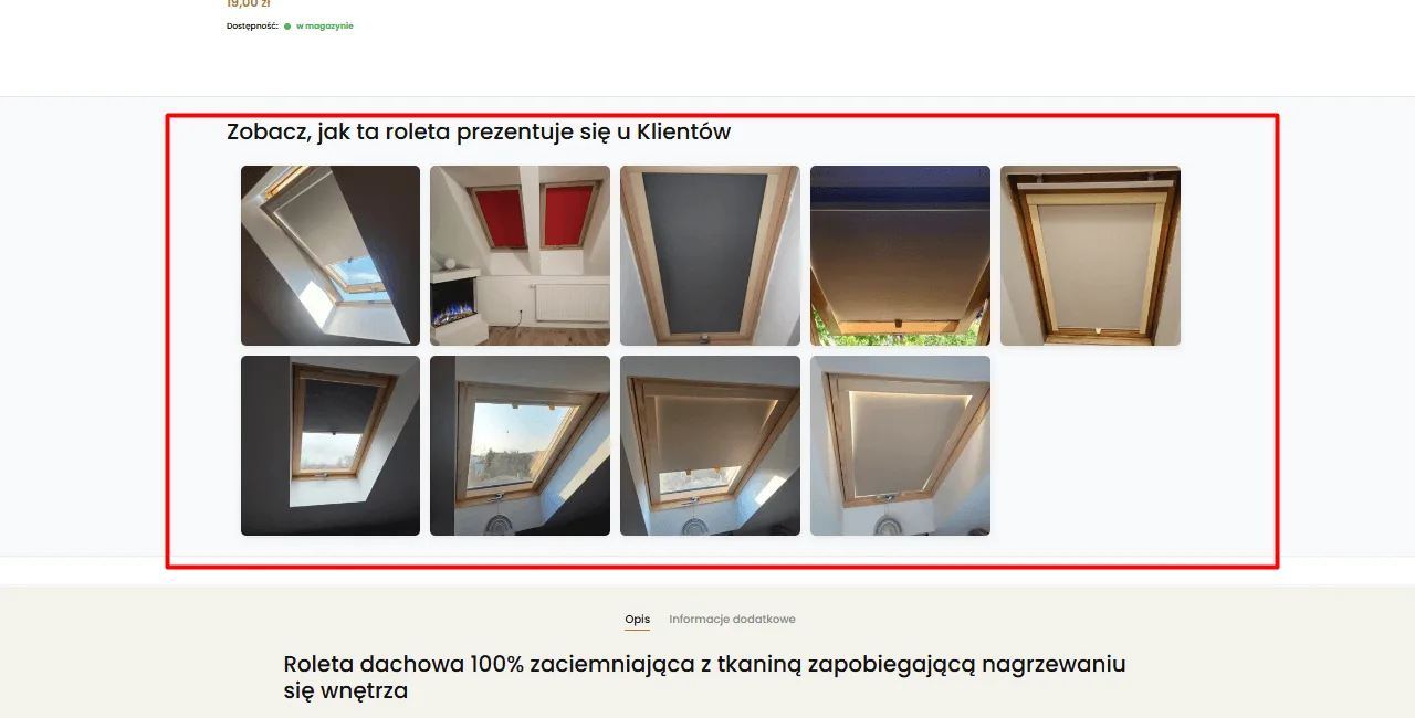
Photos from real installations instead of polished renders
Sterile product photos on a perfectly white background are fine, but shoppers see them in every store. To prove quality and how well parts fit, you need to show the product in its natural working environment – on a real window, wall or fence at previous buyers’ premises.
- Customer photo gallery (UGC): Real shots taken with a phone after the product has been installed correctly.
- Variant diversity in practice: Showing fabrics, colours and mountings in changing daylight.
- Removing the fear of low quality: Authentic photographs work many times harder than terse text reviews.
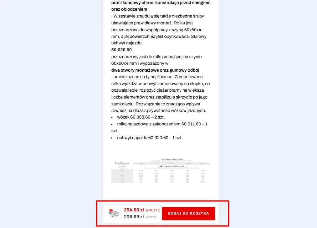
Sticky add-to-cart bar for long descriptions
When a product page carries an exhaustive technical description, dimension tables, certificates and manuals, scrolling through it on a phone takes several full swipes. If the user becomes convinced at the bottom of the page and the buy button has vanished at the top, unnecessary navigation friction appears.
- Floating bottom dock (sticky bar): A bar anchored to the bottom edge of the phone screen.
- Complete data within thumb reach: A product thumbnail, a clear gross/net price and a large add-to-cart button.
- Immediate action: The customer can complete the decision at any point while reading the specification, without going back to the top of the page.
Contact
Request a free audit of your store.
Fill in the form. Dawid, Lead Architect at PUSH, will analyse your store and get back to you within 24 hours with an actionable plan.

“Instead of hunting for random freelancers for every fix, we handed them full control over technology and campaigns. The store finally runs without issues, our customer acquisition costs dropped drastically, and we can focus solely on logistics and order fulfilment.”
Martyna – Co-owner, Rolexpress.pl