

Nielsen’s 10 Usability Heuristics in E-commerce: How to Remove Decision Friction and Recover Abandoned Carts
Most stores look for falling sales in ad rates, while margin leaks through elementary mistakes in how the interface talks to the user. Below is an engineering teardown of Jakob Nielsen’s 10 Usability Heuristics, based on real PUSH production deployments.
When a customer walks into a physical showroom, they orient themselves instantly: they see the assortment, the department signage, the staff and the till. In digital e-commerce the buyer has no sense of touch and no direct contact with staff. Every delayed interface response, every unclear delivery cost or cryptic error message triggers a natural defence mechanism: a switch to a competitor.
“Users spend most of their time on sites other than yours. That means they expect your store to work exactly the same way as all the platforms they already know inside out.”
— Jakob’s Law of Internet User ExperienceHere are 10 ergonomics principles backed by concrete deployments that remove cognitive friction and protect the buying journey.
Tell the customer where they stand – every second of the interaction
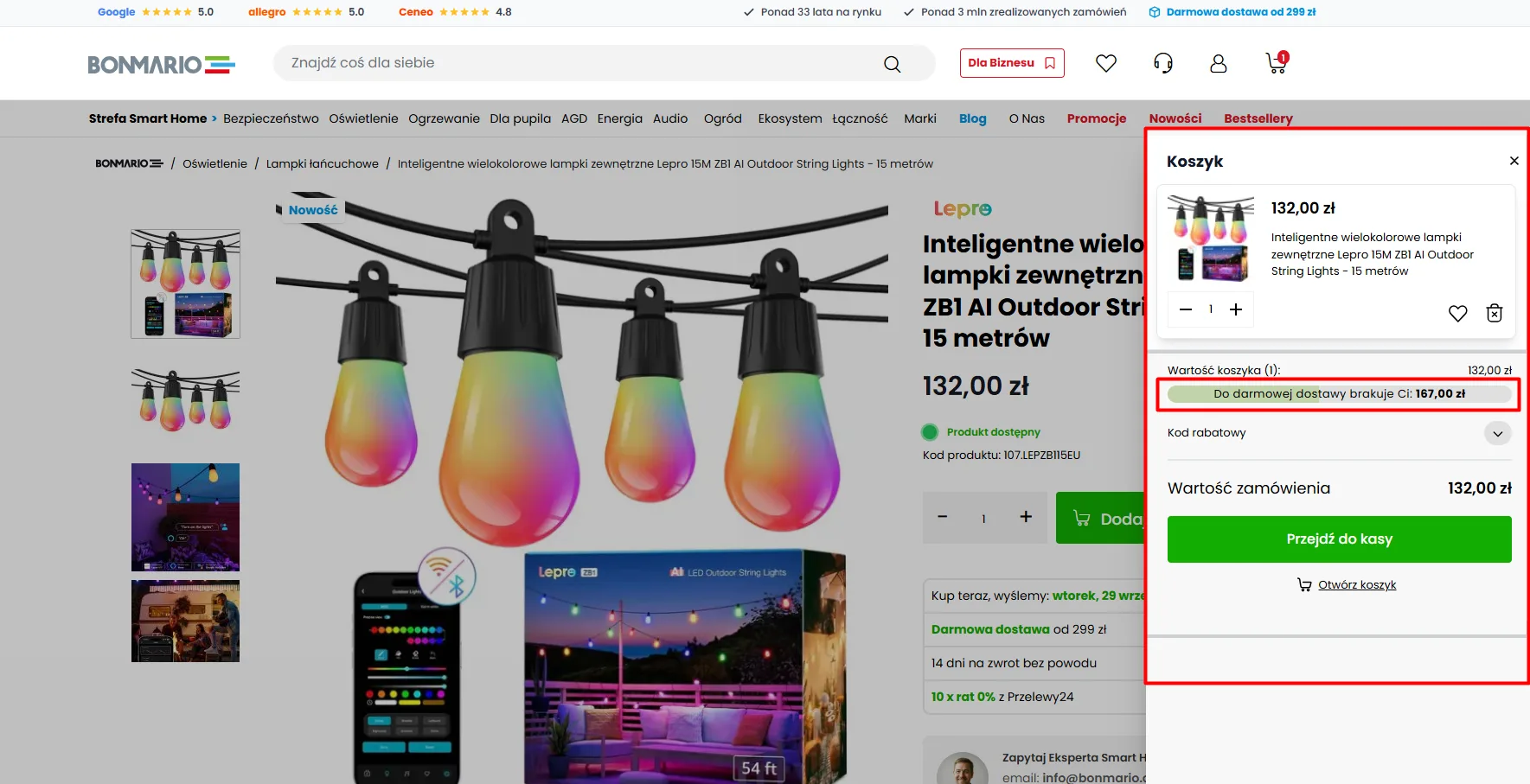
A user’s buying journey is a sequence of cognitive questions: “Did the product reach my cart?” → “How far am I from free shipping?” → “Is the store processing my order?”. The absence of an immediate visual response from the store causes disorientation, provokes repeated clicking or abandoning the session.
- Asynchronous slide-in cart: Instantly sliding in an order preview after clicking the CTA, without reloading the whole page.
- Dynamic free-shipping threshold bar: Showing the exact amount missing for free delivery motivates customers to add one more product to the cart immediately.
- Precise stock status: A clear “In stock” message with the dispatch date removes the fear of fulfilment delays.
Translate the physical product into intuitive concepts
Forcing buyers to know factory markings, manufacturer abbreviations or raw system codes paralyses the decision process. Customers do not think in terms of the store’s database – they think in terms of the item they intend to install in their own home.
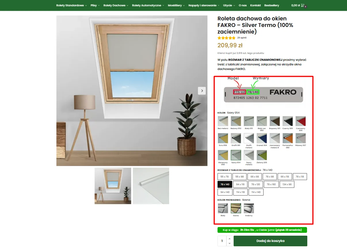
- Mirroring of physical elements: Showing a diagram of the real rating plate with guidance on which field corresponds to which dimension.
- Tile-based variant selection (swatches): Replacing dry dropdown lists
<select>with tiles showing the material texture and colour. - Contextual hand-holding: Precise selection instructions that eliminate the risk of a mistake on made-to-measure products.
Guarantee freedom of purchase on mobile devices
On smartphones (which drive 70–80% of e-commerce traffic) product pages hold lengthy descriptions, diagrams and tables. Forcing customers to scroll a dozen screens up to find the buy button breaks the transactional impulse and causes product page abandonment.
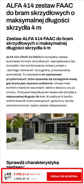
- Sticky add-to-cart bar: A bottom dock that follows scrolling and keeps the buy button within thumb reach at all times.
- Permanent price visibility: Showing gross and net amounts directly on the mobile bar protects customers from budget uncertainty.
- Smooth return: The ability to complete the decision at any point while reading the specification, without losing orientation on the page.
Stick to proven checkout architecture standards
Checkout is not the place for design experiments. Forcing buyers to learn a novel interface or hiding Poland’s most popular payment methods behind collapsed tabs drastically lowers order completion.
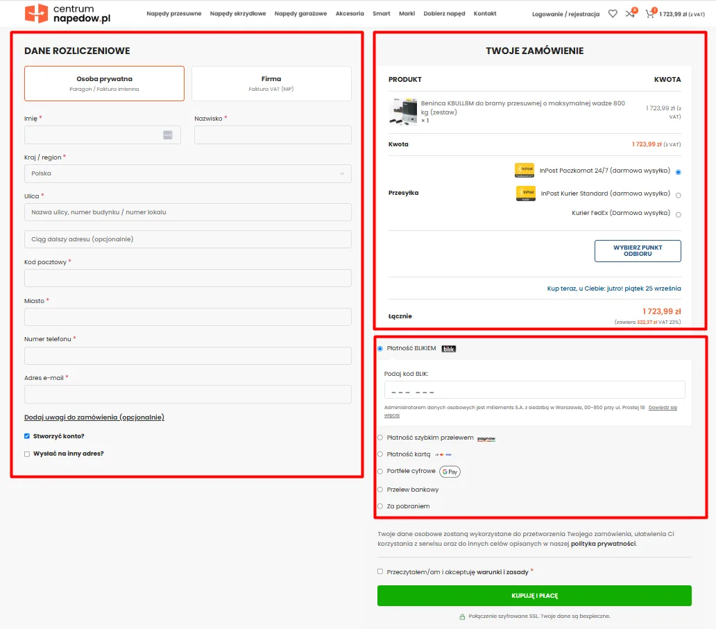
- Two-column layout: Billing and shipping form on the left, a persistent order summary on the right.
- Guest checkout: Optional account creation via a single checkbox, without blocking the flow with a password.
- Direct BLIK selection: Pulling the most popular payment method to the top of the list as a tile, with a dedicated field for the code.
Make errors impossible before the user attempts to buy
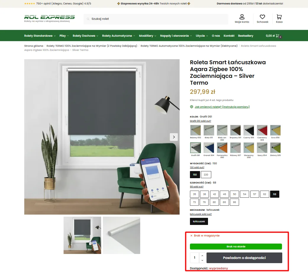
A situation where a customer painstakingly selects variants, clicks “Add to cart” and only afterwards gets a red out-of-stock message guarantees an immediate exit. The interface’s job is to protect against errors, not to punish them.
- Visually greying out unavailable options: Labels sold out and greyed-out tiles that rule out invalid combinations.
- Action button transformation: Automatic switch of the CTA to “Notify me when available” when an out-of-stock variant is selected.
- Transparent stock status: Unambiguous unavailability information before configuration even starts.
Show delivery terms directly on the product page
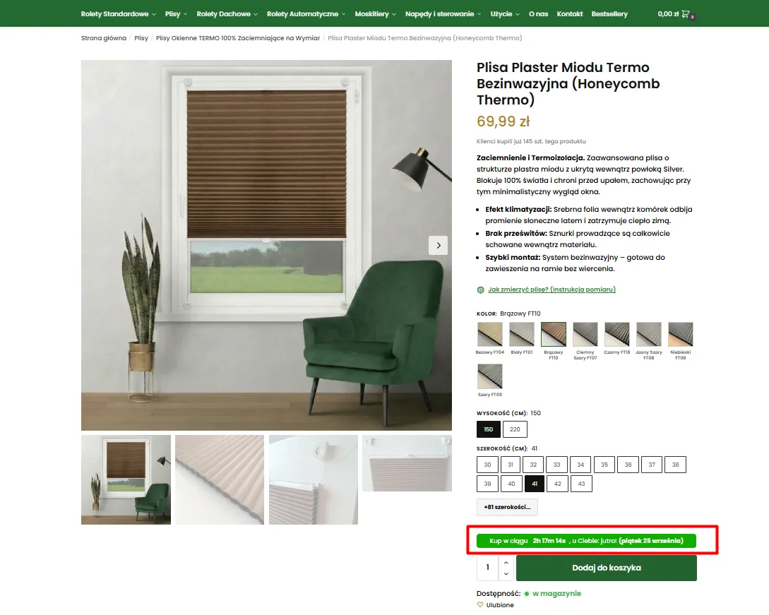
Forcing customers to hunt for fee tables in the terms or click through to checkout just to check a delivery date is the number one reason for product page abandonment in Poland. Logistics information has to sit directly in the price decision zone.
- Precise countdown: A dynamic clock showing how much time is left for same-day dispatch.
- Exact delivery date: A message naming a specific weekday and date instead of an abstract “ships within 24h”.
- Placement next to the main CTA: Placing the logistics box right above the “Add to cart” button.
Ship purchase accelerators for B2B customers and wholesalers
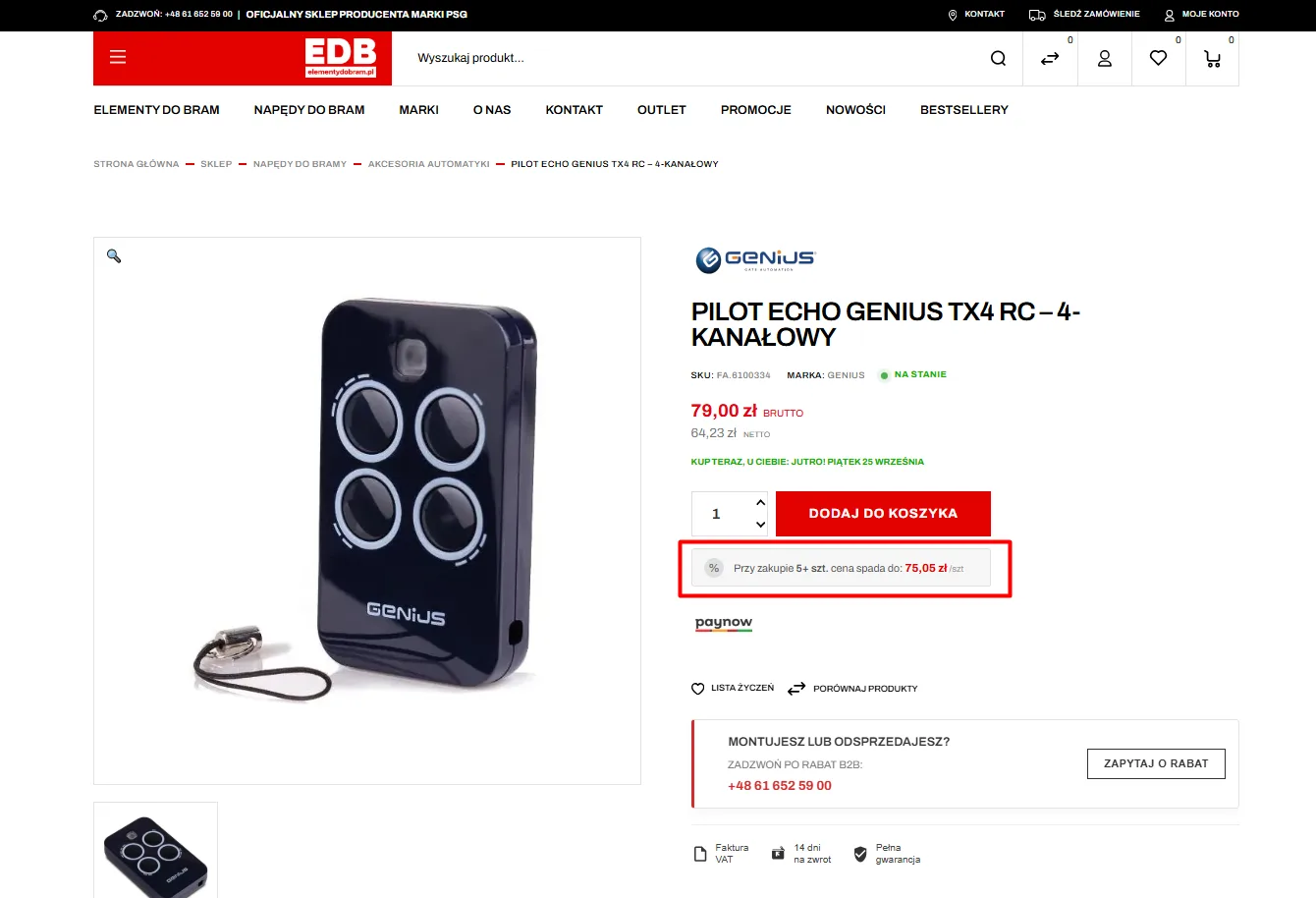
Business customers, installers and procurement teams buy in a completely different way from retail shoppers. They look for volume thresholds, wholesale discounts and a fast way to request a quote without going through the standard cart.
- Automatic quantity thresholds (tiered pricing): A clear message about the unit price drop when buying a pack.
- Dedicated box for installers: A separate “Do you install or resell?” section with a direct phone number and an enquiry form.
- Net and gross price display: Showing both rates side by side makes company cost calculations easier.
Distraction-free checkout: cut the attention escape routes
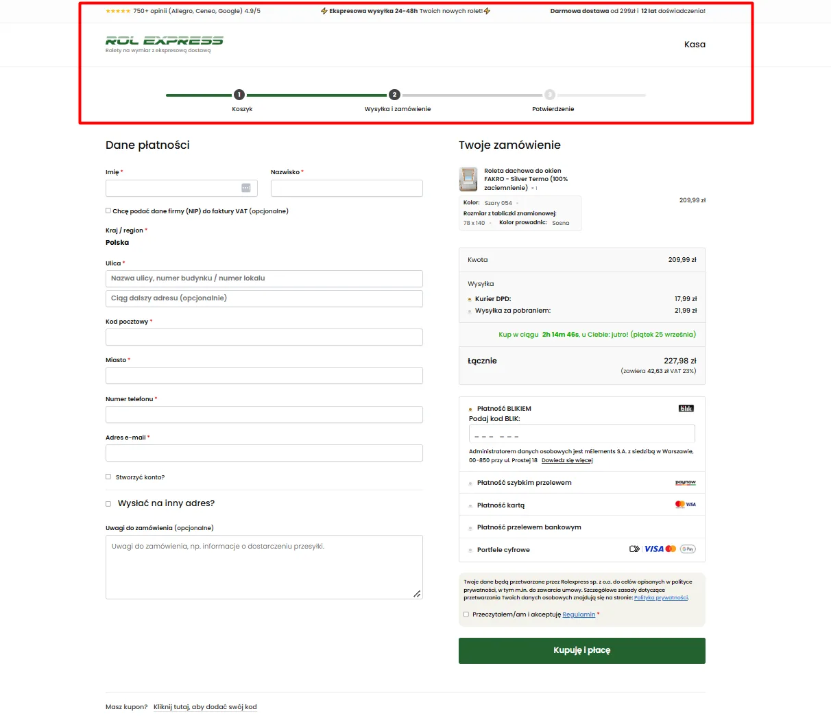
Once a buyer is inside checkout, every additional element – navigation menu, search, social media links or promo banners – becomes an attention leak. In checkout only one thing matters: flawless completion of the transaction.
- Cleaned-up header (distraction-free): Removing the category menu and leaving only the logo and the step indicator.
- Process progress bar: Step numbering (“Cart → Shipping and order → Confirmation”) that builds a sense of control.
- Discreet coupon field: Replacing the big discount code field with a subtle text link that stops customers from jumping to a search engine.
Automate data entry and stop typos
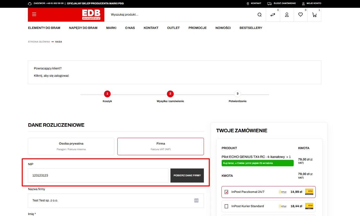
Typing company data, the legal name and the address by hand is one of the most tedious moments of a business purchase. It forces laborious copying, generates accounting document errors and extends time spent in the form.
- Integration with the Polish GUS registry via VAT ID: Fetching the full company name and registered address in one click.
- Inline field validation: Real-time format validation (postcode, email, phone) without reloading the form.
- Precise error messages: Pointing at the exact field that needs fixing instead of a generic system error notification.
Deliver instructions at the point of doubt – not in the terms
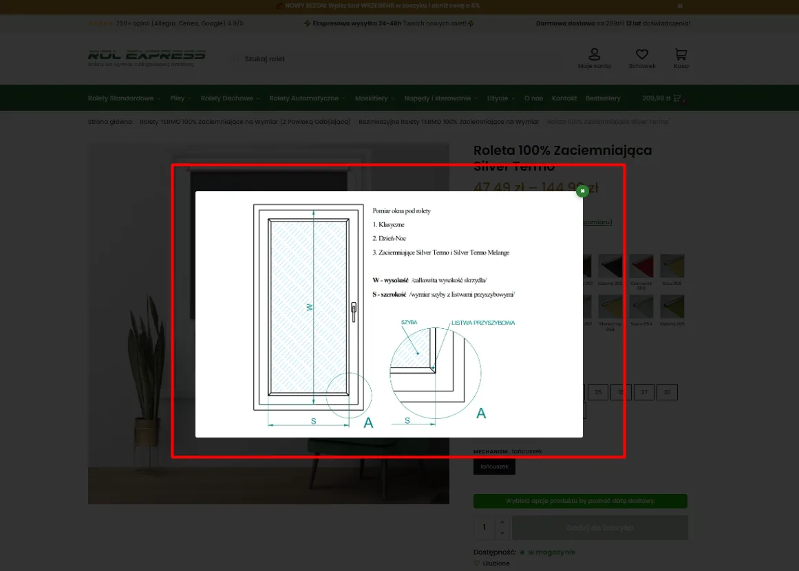
For technical or made-to-measure products, the most common reason for abandonment is the fear: “What if I measure wrong and the goods do not fit?”. Sending customers to generic blog guides loses the context. Help must be served exactly where the objection appears.
- Contextual modal (size / measurement guide): A measurement diagram opened directly from the parameter selector.
- Visual dimension explanation: A technical drawing marking the glass edge and the glazing bead, removing installation doubts.
- Closing without losing data: Fast closing of instructions without resetting previously selected configurations.
Contact
Request a free audit of your store.
Fill in the form. Dawid, Lead Architect at PUSH, will analyse your store and get back to you within 24 hours with an actionable plan.

“Instead of hunting for random freelancers for every fix, we handed them full control over technology and campaigns. The store finally runs without issues, our customer acquisition costs dropped drastically, and we can focus solely on logistics and order fulfilment.”
Martyna – Co-owner, Rolexpress.pl