

One-Step Checkout in Practice: Anatomy of 7 Checkout Errors That Leak 45% of Transactions
Getting a customer to the cart costs real media budget. Check 7 critical points of friction on the last 100 metres of the buying journey and see how we engineer a leak-proof order completion process.
When a customer clicks “Go to checkout”, the sales phase should already be over. The user has decided to buy. From that moment the process is purely engineering: guiding the buyer through the form without triggering irritation, uncertainty or the impulse to close the browser tab.
“Every additional form field, unnecessary page reload or hidden cost at checkout is an invitation for the customer to go straight back to the search engine.”
— the PUSH purchase-tunnel principleIn Polish e-commerce the cart abandonment rate ranges from 40% to 65%. Below is an analysis of 7 critical ergonomics and code errors through which stores lose almost half of the orders they start.
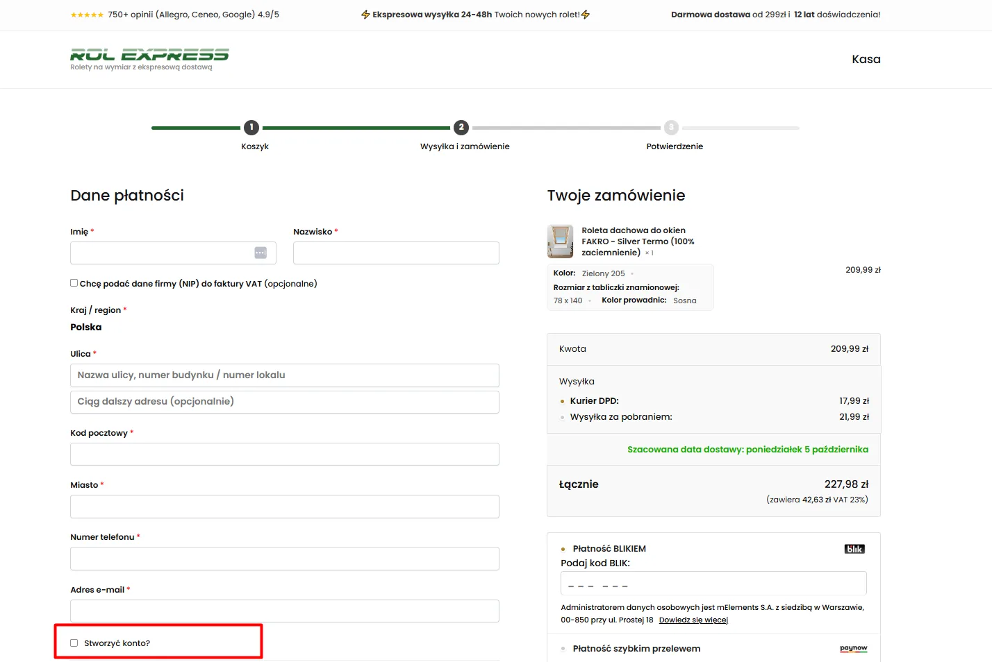
Forced account creation before paying for the cart
Forcing customers to create a password, repeat it and confirm an activation link in their email before they can pay is one of the biggest mental barriers in e-commerce. It feels like marketing spam, another set of credentials to remember and an unnecessary delay to a simple purchase.
- Guest checkout by default: Buying as a guest, without a password, must be the primary mode of the checkout form.
- Optional account: Profile registration should be limited to a single, optional checkbox.
- Silent background registration: Creating the account only on the thank-you page, with a temporary password generated and sent in the transactional email.
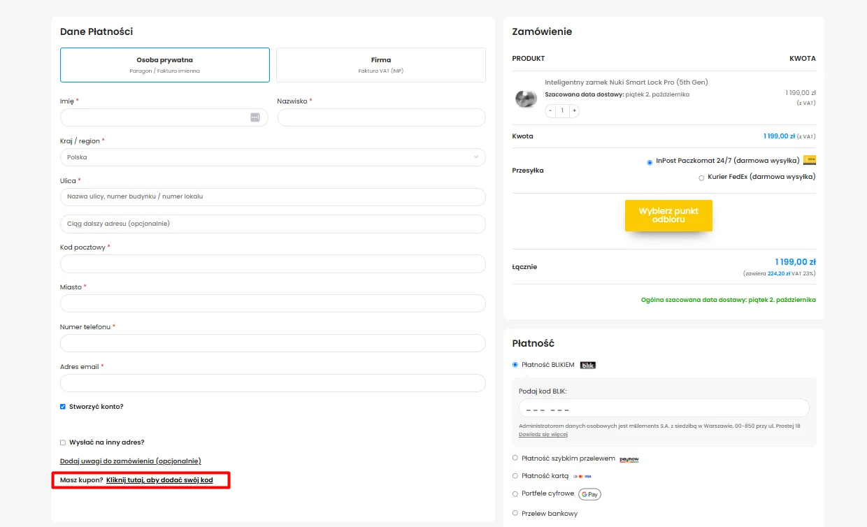
An open discount code field that sends customers to Google
When a customer sees a big open text field saying “Enter discount code” with an “Apply” button, they receive a subconscious signal:
- Hiding the field behind a text link: Replacing the big input with a discreet link:
“Have a coupon? Click here to add your code” . - Available only to those who are sure: The text field expands asynchronously only after a code holder clicks the link.
- Protecting margin and focus: Customers without a code continue the order flow smoothly, without feeling they are losing out.
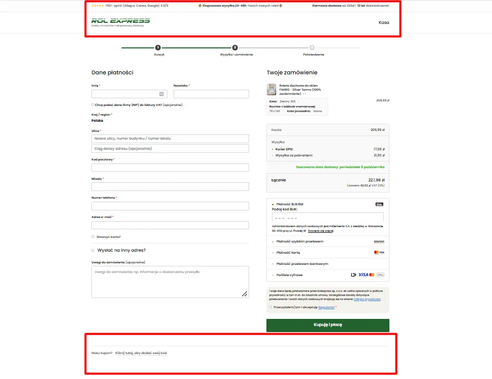
Leaving the full menu and promo banners in checkout
Checkout is not for browsing. Leaving the full category tree, product search, social media links or promo banners in the header opens dozens of escape routes on the final straight of the order.
- Cleaned-up header (distraction-free): Removing the navigation menu, footer and distracting banners.
- Process step indicator: A readable progress bar (Cart → Shipping and order → Confirmation) that builds a sense of safety.
- Exposure of trust signals: SSL certificates, fast payment logos and secure delivery guarantees.
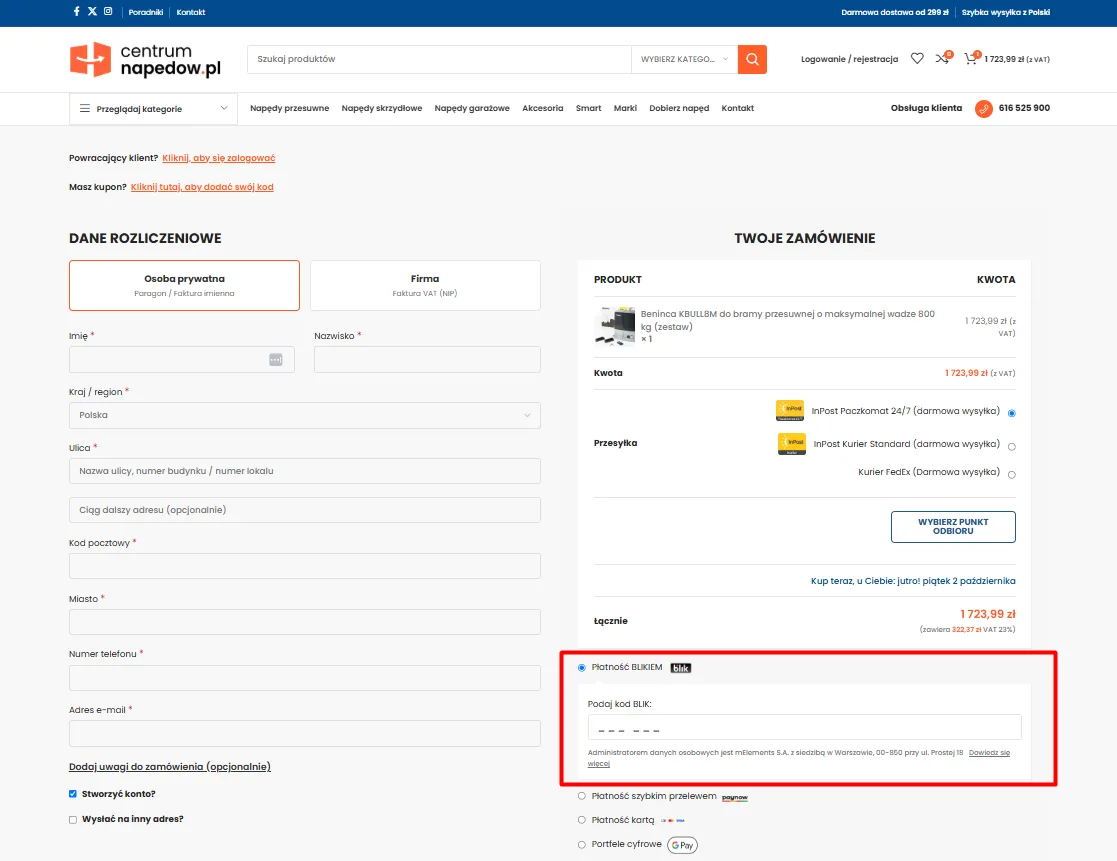
Redirecting to third-party platforms instead of native BLIK
In Polish e-commerce BLIK accounts for more than 65% of cashless transactions. Hiding this method behind an external payment broker’s logo and forcing customers to pick a bank only after a redirect to an external site breeds resistance and technical uncertainty.
- BLIK first: Exposing the BLIK tile at the top of the payment methods list as the default choice.
- A 6-digit field inside the store interface: Entering the BLIK code directly in checkout, without redirects to external domains.
- Tile-based selection of alternatives: A clear list of instant bank transfers, payment cards and digital wallets (Google Pay, Apple Pay).
Retyping company data instead of GUS registry automation
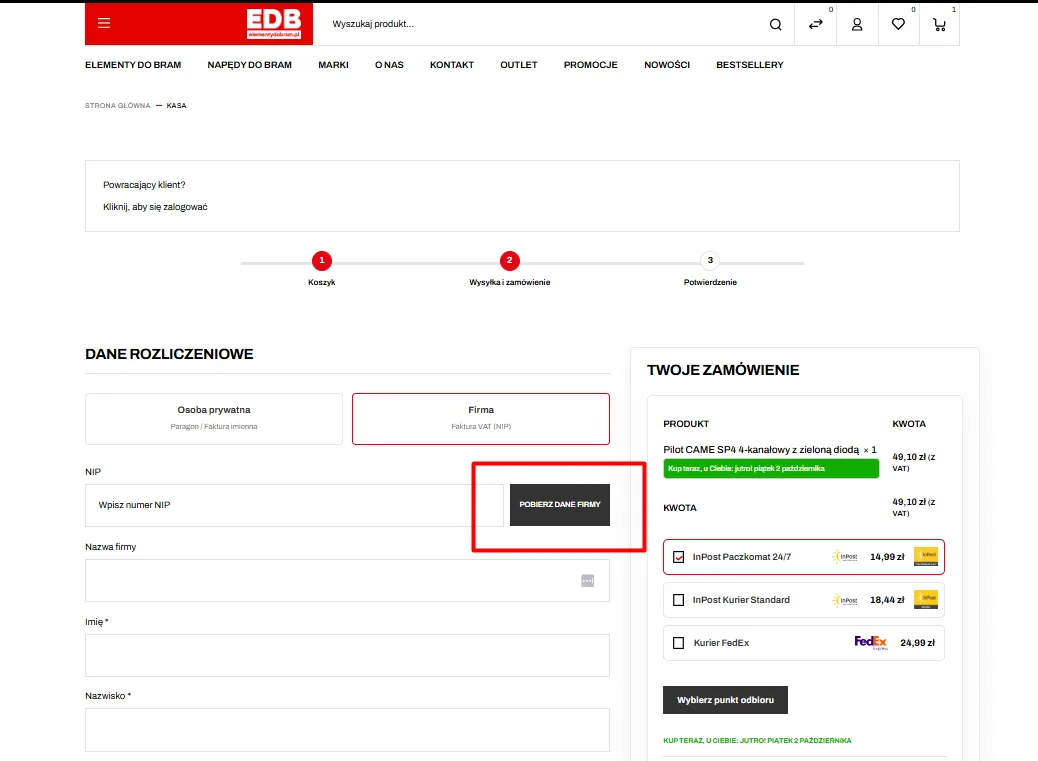
Business customers buying on a VAT invoice are forced to laboriously type the entity name, legal form and registered address. On a phone that creates frustration, typos in accounting documents and later costs of issuing corrective invoices.
- Integration with the public REGON/GUS API: Automatic data retrieval after entering the 10 digits of the VAT ID.
- Field autocomplete: Instantly loading the company name, street, city and postcode with one click.
- Shortening checkout by 40 seconds: Eliminating VAT ID and invoice data errors entirely.
Freezing the form on every delivery method change
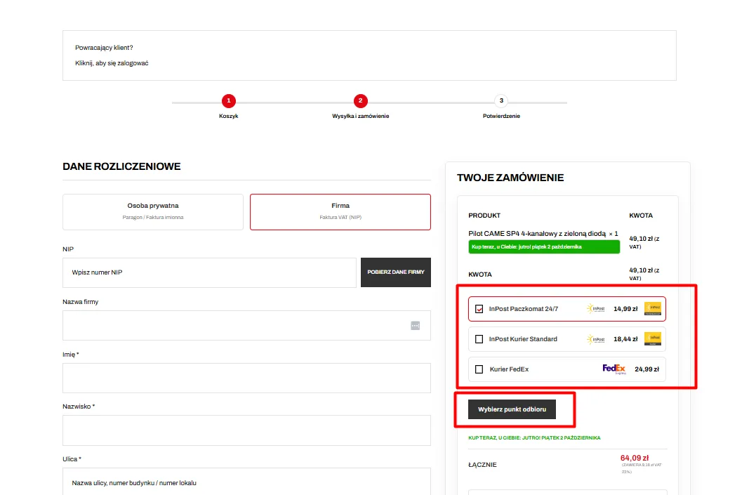
Reloading the whole page or blocking the view with a grey spinner when the courier changes (e.g. from Courier to InPost parcel locker) destroys the user experience. On mobile connections it risks losing data already entered and instantly breaking the transaction.
- Block-level refresh (AJAX / REST API): Recalculating only the totals block without touching the rest of the interface.
- Lightweight point picker modal: The parcel locker map opens in an optimised window without resetting the form state.
- Interaction fluidity: The form stays fully active and responsive while talking to the server.
No numeric keyboard and validation only after clicking buy
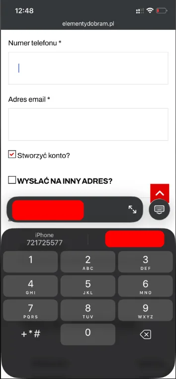
Reporting errors only after the finalise button is clicked, combined with a terse “The form contains errors” message that names no field, guarantees cart abandonment on a phone. Equally painful is the lack of a system keyboard matched to the data being entered.
- Forcing the numeric keyboard: Attribute
inputmode="numeric"that brings up large digits for phone, postcode and BLIK code. - Real-time validation (inline validation): A green validity mark immediately after the cursor leaves a field.
- Automatic scroll: On a mistake the screen scrolls smoothly to the first invalid field with a precise fix instruction.
Contact
Request a free audit of your store.
Fill in the form. Dawid, Lead Architect at PUSH, will analyse your store and get back to you within 24 hours with an actionable plan.

“Instead of hunting for random freelancers for every fix, we handed them full control over technology and campaigns. The store finally runs without issues, our customer acquisition costs dropped drastically, and we can focus solely on logistics and order fulfilment.”
Martyna – Co-owner, Rolexpress.pl